Saturday, August 31, 2013

Exploring Nature with Art and Science

Tomorrow starts my grand plan of a year of exhibits, classroom projects,
and blogs "Exploring Nature thru Art and Science (ENTAS):"
Nature of Science
Art of Nature
Biology for the Seasons
Natural History of Teaching

 
I'm so jazzed, I'm barely registering the amount of work that lies ahead.
If work feels like play, it must be right :).


First up, all of September, is the process of assembling and displaying
The Nature of Science: Science Illuminations

My art pens are in the ready position...

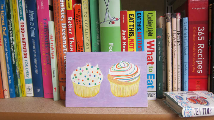
The tea supply has been replenished...


And in case of artistic emergency, there is plenty of back-up candy :).

Friday, August 30, 2013

One More Project...

Along with Nature of Science, Art of Nature, and
Biology for the Seasons, I'm tacking on one more project:
A Natural History of Teaching.


A Natural History of Teaching will have three rotating exhibits:
Abecedarium (Objects representing a lifetime of teaching)
Advertisement (Design and delivery in the classroom)
Lexicons (Visual and verbal teaching expression)

The plan is that the three exhibits will rotate through our classrooms,
this display case, and on this blog in Oct and Nov, 2014.

Thursday, August 29, 2013

Studio is Set Up

All of my books are in order (here's the food science section)...

My extra brushes and pencils are lined up...

A few paintings are up for inspiration...

And biology models are scattered around waiting to be drawn.

Wednesday, August 28, 2013

Sakura Koi vs. Winsor & Newton Cotman

Winsor & Newton Cotman paints on the left, Sakura Koi in the middle,
and Peerless watercolors (knock-your-socks-off bright) on the right.

Despite repeated attempts, I have been not able to bond with the
paints in my travel W&N cotman case.  Some of the colors seem too
pale, others seem to dance away from my hot pressed paper.

I've replaced that palette with the Sakura Koi set, using
the collapsible W&N brush with this kit's water brush.  The
range of colors and ease of use make this a winner for me.

Tuesday, August 27, 2013

Peerless Watercolors

I ran across Peerless Watercolors in a scrapbooking article.
Transparent watercolors coated onto a paper film.
This sampler sheet is from an Etsy seller.

I swiped the colors next to the names, yes they are that bright dry!

These paints take my breath away, almost fluorescent, mixing to the
clearest grays and browns I've ever made.  I have no idea how fugitive
they are, but the range of pinks alone will draw me back for more.

Monday, August 26, 2013

238 Daniel Smith Watercolors

 Daniel Smith has an incredibly tempting range of watercolors,
and you can try 238 of them with their paint dot cards.
Its just like using dry pan watercolors.

The paint is placed onto printed watercolor paper, I've swiped each
with a wet brush to test the colors.

 This is a great way to try the paints. the only down side is that
you may want to buy more than ever.

Even the specialty paints like the Primatek and iridescents are represented.

Since my paintings are miniatures, I'm thinking of seeing if I can paint
a whole exhibit of paintings off one set of sample cards :).

Sunday, August 25, 2013

Ice Cream Bliss

Last, but not least, of my design inspirations is Everything Goes with Ice Cream
by Koralee Teichroeb (who also has a wonderful blog, Bluebird Notes).

The artist's photography is a highlight on every page.

I especially like the page lay-outs: a unifying color theme (sky blue here)
and three to five design squares that share color and pattern.

 
Here is canary yellow, with sparks of vermillion highlights.

Browns with touches of green and orange floral trim.

Pretty purples and periwinkles, balanced with warm notes.

Even hot melon colors work in this seamless grid design.

 
The china pattern dresses the granola up a notch.


Just one more lick of ice cream!

Saturday, August 24, 2013

Homespun Style

Continuing my style splurge, I'm oogling Homespun Style by
Selina Lake (I really like the bold pinks in Romantic Style too).

Light airy rooms with plenty of patterned and colored furnishings.

 The mix of textures and tones seems cozy to me.

I especially like all of that boldness against white walls and neutral floors.

Beauty can be found in many forms, all around us.

Friday, August 23, 2013

Find & Keep

We are living in the post generic beige-white decor era and smack dab in the
recovery phase: splashes of color against those white walls.  Beci Orpin leads
the way with the whimsical Find & Keep.

 The artist shows how a lifetime of collected favorite odds & ends
can be the starting palette for broader design.

 The second I thumbed through this book I started
adding to my drawers of ephemera.

Artists who share their happy and quirky perspectives
are worth their weight in gold!


Thursday, August 22, 2013

Candy Extreme

 I haven't been to a Dylan's Candy Bar, but I adore this book.

 To be honest, I haven't read a paragraph, I keep
getting sidetracked by the mindboggling photos.

 A page of pastel sweets? Oh yeah, this is happening.

 I can practically taste the Easter frosting.

And of course the obligatory candy sundae to finish.

Wednesday, August 21, 2013

Pretty Pink Princess

Another design inspiration is the series of Pink Princess cookbooks
(cupcakes, ponies, fairies) by B. Beery.

 
The ideas and photography are luscious.

Each book has a slightly different theme.

If every day is a party, these books capture the spirit.

Its also impossible to resist Tiny Treasures from American Girl.

 Cute and detailed miniatures you can actually make yourself.

 This iced fluffy cake is actually a painted sponge!

My favorite piece may be a personalized shelf,
a form of self-portrait.