Showing posts with label Colors. Show all posts

Friday, September 27, 2013

Office Rainbows

Its occurred to me my world is getting more and more colorful,
and that's evident in my office and professional life too.

My projects and planning have taken on more flavor...

I'm extending beyond the sciences to the beauty of the arts.

Lecture shoes next to greenhouse boots, both in full-on pink.

A bit of stray Vera Bradley for extra punch.

Bold new designs match zany new ideas.

The quest for color and pattern is permeating into our courses.

It all seems a bit happier and fun.

Thursday, September 26, 2013

Living in a Rainbow

A few weeks ago it just hit me how much more colorful my
world is becoming, both figuratively and literally.

 
It started with actually physically collecting colorful things.

The physical light and sparkly spectrum kept me company on
some of my darkest days.

Then my mind broadened "colorful" to mean variety: tastes, smells,
a wider range of thoughts and experiences.

But I'll keep taking my visual rainbow with me everywhere too.

Saturday, September 21, 2013

Me and Mom

I think its pretty clear I got my love for colors from Mom. We're doing
a self-portrait with an ipad, it took 20+ attempts until we both were
looking at the tiny camera, and I almost dropped it a few times first :).

We can both have fun anytime, anywhere (thanks, Mom!).

Tuesday, September 10, 2013

Happy Home

The second I opened Happy Home by Charlotte Gueniau,
the style felt so familiar, its the feel I'd like to achieve with my art.

White backgrounds, black touches, splashes of bold colors,
and quirky, friendly touches.

Just enough pattern to pull it all together.

I'd love my art studio to have this energetic vibe,
I can see drawing and painting at that table.

Creative touches following you everywhere,
keeping the senses stimulated and aware.

Places for the little things that can brighten every day.

Saturday, August 17, 2013

Progressive and Romantic Colors

Ace Hardware currently has a total of 11 indoor paint color groups,
four I love (previous four blogs), five were outright rejects,
two did not quite work for me, but had notable features...


The "Progressive" colors mix cool and warm colors of different intensities.

I can't help it, this grouping makes my skin crawl, except the left page,
the "Edgy" colors ooze caramel and chocolate cherry, they get a pass.


The "Romantic" grouping is, you guessed it, all about pink...

Now, I adore pink, but I think it needs a firm hand, even the pastels.
I like this palette, but don't love it, the pinks need some counterbalance.

Overall I am really impressed with the Ace color team, I have never found
big color groupings I like, and they put together
four winners & two maybes for me.

Friday, August 16, 2013

Sophisticated Colors

Today is the last of my quad of seasonal color schemes, co-opted
from Ace Hardware indoor paint colors: wintery jewel tones.

 Snow white plays a dominant background with sparkly ornaments
of color accents.

"Opulent" brick fireplace colors (dried tomato, adobe clay)
with "Majestic" tones (belladonna, crushed velvet, India ink).

"Cultured" (strands of gold, tea leaves, platinum) highlights with the
nautical "Lavish" splashes (spruce tree, Acropolis, Panama blue).

Emeralds, sapphires, rubies with hints of pearls, diamonds
and precious metals in old wooden jewel boxes.

Thursday, August 15, 2013

Worldly Colors

Next are the "Worldly" colors of a luscious fall harvest.

 Well, at least my dream autumn colors, plenty of range and punch.

"Spicy" colors (tropical sun, sunburst, Santa Rosa) heat up
"Lively" choices (cherry chocolate, orange taffy, dazzling red).

"Exotic" (Rogue river, purple grandeur, Ming vase) tangle with
"Vibrant" (tropical grass, hazy sunshine, Key Largo).

These combos look a little weaker than the other groups,
but some of the colors bring it on (hot sun, cranberry portage).

Wednesday, August 14, 2013

Charming Colors

My second favorite Ace Hardware color scheme (after "Playful")
is the "Charming" pastel medley of springtime colors.

Light, bright, and just plain happy.

"Cheerful" yellow choices (Goldilocks, firefly, spun gold)
and "Alluring" (crabapple blossom, desert air, rising sun) too.

"Fresh" Easter egg favorites (rain drop, lavender bounty) and
"Blissful" cottage colors (fresh foliage, country garden).

Reading the colors schemes right to left, you can be sunkissed
with a touch of lemon and aura of evergreen.  Mmmmm.

Tuesday, August 13, 2013

Playful Colors

I am addicted to some of the Ace Hardware indoor paint color schemes.
Today is "Playful," summery and bright colors.

Bam!  I smile every time I open this folder.

The names are a kick like "Youthful" (whipped butter, orange sherbert)
and "Fun" (mango tango, luscious lips, and fantasy flair).

"Energetic" (lemon grass, clearfield) and "Carefree" (up, up, and away,
lost in space, irresistible iris").

Each line going across here is supposed to be a coordinated
color scheme (accent, secondary hues, and dominant color).
I'm not sure about these, but love the word combos: instant poetry!

Saturday, July 6, 2013

Cozy Color Landscape

The boys are snoozing and I'm biking and thinking about how colorful
my world is becoming...

White background with a splash of rainbow, my favorite combo.

When did all this color sneak into the house?

Monday, June 3, 2013

Friday, March 15, 2013

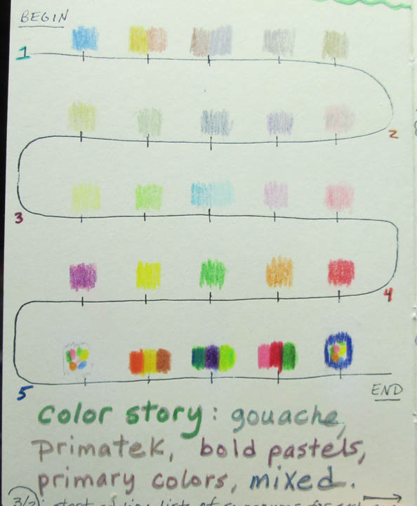
Color Story

For The Art of Christmas, each of the five chapters
and each of the 40 pages is going to have a separate
color theme, building to the vibrant ending.

The colors match up with the narrative, for example
the "real joys" two-page spread has clear blues ranging
from the peaceful aspects of joy (blue-violet) to
the exhuberant aspects of joy (blue-green).

Shades and hues of green form the foundations of the chapters,
with the "Merry Bright" reds, pinks, white, and black interspersed.

Well, that's the plan now, it may all end up a bit like this :).